Virtualizing Treeview – aka TreeListBox

Before you start reading – I have a new version of the  TreeListBox available here

INTRO

Happy birthday to you, Happy birthday to you….. yahooooo today is my birthday!!! yes guys, it’s true today is my birthday and so yesterday I decided that I am going to give the developer side of me a birthday present!
I was thinking about this, when suddenly while having my daily bread (i.e reading the www.beacosta.com blog), I saw it ! the perfect birthday present, A Virtualizing TreeView Control!!!

UI Virtualization is really cool yet it is also complex. I had a chat with one of the best WPF developers I know Dr.WPF and he explained to me how complex it would be to have a VirtualizingStackPanel that understands hierarchies (have a look at the chat over here). As I already said this all started from the Beatriz Costa blog post, so I could just have used the same approach as beatriz (which by all means is good as the one I am using). But you know me, I like to build space shuttles (maybe even if it’s for nothing 🙂 ).

So there I was with my pen and paper, packet of ciggarettes, mug of pure coffee and my beloved laptop(aka ‘marlon-csharp’)…
The Basic Idea
The basic idea is to have a listbox that understands hierarchies and populates a flat list instead of using the hierarchal list approach… something like the following

Actual tree structure

0
  child1 of 0
  child2 of 0
1
  child1 of 1
  child2 of 1

where here the data items are in 3 seperate collection >>
 1 for the main list (0, 1)
 1 for the children of 0(child1 of 0, child2 of 0)
 1 for the children of 1(child1 of 1, child2 of 1)
Flattened list
0child1 of 0
child2 of 0
1
child1 of 1
child2 of 1

on the other hand the flattened list would be one collection that contains all the items inside…

Basically the whole concept is to force the ItemsControl(which is our listbox) to stop from generating the Items by it self so that we can do it and set what ever values we want. If the ItemsControl thinks that it has a flat list BAMM you have it – Virtualization at last. Then it is just a matter of changing the look of the listbox to look like a treeview…

The Actual implementation

In order to implement the virtualization feature I simple extend the ListBox control with 2 new properties

ChildItemSourcePath
This is basically a string that contains the name of the property exposing the collection of the children
Basically this is the Path you would enter for the binding of the HierarchalDataTemplate i.e

<HierarchalDataTemplate ItemsSource=”{Binding Path=Children}” …
transalates to
ChildItemSourcePath = “Children”

Basically this property is used so that by reflection we get the list that contains all children and populate them in the flattened list.

HierarchalItemsSource
This property is just like the ItemsSource property yet when using the TreeListBox you must use this property for the data source, since this populates the ItemsSource by setting it to the internal flat list…
So if before you had this code in the tree view

ItemsSource = xList;
translate to
HierarchalItemsSource = xList;

Important – You should never use the ItemsSource property of the TreeListBox

—————————— 

Now the fun part begins……

int counter = 0;

foreach ( object item in newValue)
{   
       TreeListBoxItem
listItem = new  TreeListBoxItem (this, compositeChildCollection, 0);
    
       this
.PrepareContainerForItemInternal(listItem, item);    
     compositeChildCollection.Add(listItem);
   
     counter++;

}

this.ItemsSource = compositeChildCollection;
This code snippet basically is the whole concept. We prepare the items for the ItemsControl(i.e the listbox that we inherit from). In this way we can add the level property and we can also pass the compositeChildCollection which is out flat list so that the children can add themselves to this list. Now the children do practically the same thing


//get the current index of the current item from the flattened list. this index is then used to insert the child item for this item in the appropiate index

int currentIndex = parent.ItemContainerGenerator.IndexFromContainer(this);
//create the item yet this this the level is the current level + 1
TreeListBoxItem listItem = new TreeListBoxItem(parent, compositeDataItems, level + 1);
//ask the parent (which is the TreeListBox) to preapare the actual item

parent.PrepareContainerForItemInternal(listItem, item);
//add the new item in the Children collection of the current item
childTreeListBoxItems.Add(listItem);
//add the newly created item to the flat list (childTreeListBoxItems). this is a very important part. here we insert the item in the appropiate index of the flattened list
compositeDataItems.Insert(currentIndex + lastItemCreatedIndex, listItem);
lastItemCreatedIndex++;


And this is basically how we add item and child items in the TreeListBox… Now how can we remove them. This is relativly easy…
//we pass the item to delete to the remove method and this will automatically get the correct index for the itemand remove the item from the flattened list
compositeDataItems.Remove(item);

I hope you are still with me because basically this is it… You will for sure understand more if you have a look at the actual code! This is what I call the TreeListBox which is basically a normal Listbox that thinks its a tree view 🙂I hope you find this control useful, please send as many feedback as you can….I guess you all know my email, if not this is it marlongrech@gmail.com, contact me if you need anything…Now I think I need some sleep !!!Best Regards
Download Source Code
 

Window Control…

Loads of time I had to create a control template to restyle the window. The problem is that 99% of the times you have to do tricks to restyle the title bar…

I found a very good control that can do this for you….

http://pavanpodila.spaces.live.com/blog/cns!9C9E888164859398!345.entry

 Have fun!!!!

Listview sorting ….

Hello,

One handy feture to have when working with a listview is sorting…. WPF supports sorting by using ICollectionView SortDescription (When the ItemsSource of your listview is an IList you can use the CustomSort for even better performance)

Yet the listview control does not have inbuilt support for sorting, so I decided to make this functionality once and reusable…

Download Source + Demo here…. 

If you need any help or maybe if you do not understand clearly how to use this new feature that I have included please submit a comment on the blog or send me an email at marlongrech@gmail.com….

Regards

Update on the DatePicker

Hello guys,

Thanks to the comments submitted by Andreas I have updated the date picker with a new feture…

Basically now you can have a better and faster navigation when using the DatePicker by using the month selecter and year selecter. The month selecter is basically a combobox that you can use to navigate to other months, the year selecter is basically a textbox where one can enter a specific year….

I am now working on sorting of the listview for multi columns + I am also including a custom comparer that can improve performance for the sorting….(The source code is included in the AvaolonControlsLibrary download, yet I still need to work more on this feature)

Again thanks Andreas for your input… hope to get some more feedback…

Download Source + Demo

Regards

WPF DatePicker

[New Version of DatePicker available here] 

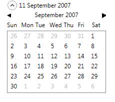
Here we are again…. this time it is a date picker control…. Yesterday, I couldn’t get any sleep so I decided to
build a sinple date picker control… It is very simple but I think it is very useful to have…
This control has a dependency property named CurrentlySelectedDate that gets updated when ever the use selects a
new date and that’s basically it… wow how nice… 🙂

One cool feature of this control is that it is restyleable… You can create a Control template to completly change

the look of the control… in the demo propeject I create a simple control template to show this feature… for

those of you who want to create a control template and use this control here are the PART names to use

“PART_MonthBack”, Type = ButtonBase, This button is used to navigate back to the previous month
“PART_MonthForward”, Type = ButtonBase, This button is used to navigate back to the previous month
“PART_CurrentlyViewedDate”, Type = ContentControl, This control is not need as such but basically this control
(if set) gets automatically databound to the current Month + Year in view
“PART_Dates”, Type = Selector This control gets populated with the days of the crrently

viewed month….

In the DatePicker I also create 2 converters one to calulcate width for the date cells(CellSizeConverter) and one to gray out the days that are shown in the Selector control but are not in the current month (IsCurrentMonthConverter). feel free to use these as well… to have a better idea how to use these converters have a look at the Generic.XAML file in the AvalonControlsLibrary project under the Themes folder….

Please contact me if you need any help with this control…

See alse DateTimePicker

Regards

Download Full Source code + Demo here…

DatePicker

RangeSlider support Control Templates….

Hello,

yep the title of this post says it all.. I refactored the Range slider so that now it can support control templates… so basically instead of setting all those syle (this was how you could restyle the control in the previous version), now you can just create on control template to restyle the control however you desire…

The parts you can restyle are named as follows

“PART_RangeSliderContainer” (StackPanel), this control acts as the container of all the other inner element. Please note that the oraintation for this control will always be Horizontal even if you re style, since the Range slider only supports horizontal oriantation for now….

“PART_LeftEdge” (RepeatButton), This is the left side of the range slider. (in the demo there is the text click me)

“PART_RightEdge” (RepeatButton), This is the right side of the range slider(in the demo there is the text click me)

“PART_LeftThumb” Thumb, This is the thumb on the left side. the users use this thumb to expnad/shrink the selected range

“PART_MiddleThumb” (Thumb), This is the middle part of the slider. users use this part to move the range back and forward by dragging this thumb.

“PART_RightThumb” (Thumb), This is the thumb on the right side. the users use this thumb to expnad/shrink the selected range

an example of such a control template would be something like the following

<ControlTemplate TargetType=”{x:Type local:RangeSlider}” x:Key=”rangeSliderTemplate”> <StackPanel Name=”PART_RangeSliderContainer”> <RepeatButton Name=”PART_LeftEdge” Background=”AliceBlue” Content=”click me”/> <Thumb Name=”PART_LeftThumb” Cursor=”SizeWE”/><!–This size of this thumb will auto matically change by the control to 10–> <Thumb Name=”PART_MiddleThumb” Background=”AntiqueWhite” Cursor=”ScrollAll” MinWidth=”10″/> <Thumb Name=”PART_RightThumb” Cursor=”SizeWE”/><!–This size of this thumb will auto matically change by the control to 10–> <RepeatButton Name=”PART_RightEdge” Background=”AliceBlue” Content=”click me”/> </StackPanel> </ControlTemplate>

if you have any problems please contact me on this blog or send an email at marlongrech@gmail.com

Download Source Code + Demo Project


WPF Range Slider Control

[New version fo Range Slider here] 

I know that you guys are waiting for the sorting of the DataGridView control, and I apologize for not completing it

yet. I needed a range slider, so I had to stop for 2 days to create this control… While I was at it I also

created a Magnifier (which is a normal slider but centered i.e when you release the thumb it goes back in the mid

point. more info below)…

The range slider is basically just like a normal slider control but you can select a range instead of a single

point. You can even drag the middle part(which is the selected range area) to move back and forward… It is very

easy to restyle this control, Basically there are 5 main properties that you can set

CenterThumbStyle – this is the area of the selected range (this is a thumb control)
LeftThumbStyle – this is the left slider thumb which is used to expand the range
RightThumbStyle – – this is the right slider thumb which is used to expand the range
LeftRepeatButtonStyle – this is the left edge of the slider (When click on the button you move the range selected

to the left)
RightRepeatButtonStyle – this is the right edge of the slider (When click on the button you move the range selected

to the right)

These properties all accept a style as parameter so that you can re style the control however you want.
Whenever the range is changed an event is raised providing you with the new range (RangeSelectionChanged).
A demo for the range slider + full source code is provided here…

The magnifier is a very simple control. Basically it is a normal slider yet, this slider goes back at the mid-

point(with a nice animation) when the user releases the slider thumb. When the user is holding the thumb to the

left or to the right a Magnified event is raised every x (where x is a TimeSpan set by the user). This can be used

to make a magnifing effect or even shrinking effect accordingly… have a look at the demo to get a better feel of

this control….

Any question, suggestions or comments please feel free to post. It is always nice to hear feedback…

Have fun coding….

Regards

P.S if you have some ideas or need a specific custom control please let me know so that I added to the backlog of

the controls to include in the AvalonControlLibrary

Source code and demo >>

Listview with auto generation of column + enable disable columns

hello guys,

Back in the days of winforms in .Net 2.0 and 1.1, one of the controls that I really loved was the datagridview aka datagrid.

One of the most powerful features of the data grid was that if you wanted to; you could just specify an ItemsSource and the datagridview would create all the column for you. The data grid would do this by looking at the object properties by reflection. Unfortunatly WPF does not have such a control, yet WPF is flexible enough to let you do something similar by using the listview.

I have developed a similar control to the DataGridView that supports auto generation of columns by looking at the properties of the object that you push from the ItemsSource…

Auto generation of columns sometimes is to implicit. Sometimes you would like to order your column, exclude a property from showing in the listview or even display the header text differently than the property name… My solution was to create a custom attribute that can specify additional information for the datagridview control. This is very easy to use but yes, you are coupling the business object with UI specific information, so please if anyone has some feedback/ideas how I can improve this let me know…

Another interesting feature that this control supports is the concept of having Collections as propeties. The question here is “How do I represent the data of my collection in the listview?”.
Well from experiance I can say that usually you would need only the count of the collection or maybe the last value of the collection (maybe even something else that is truly custom), so what i have introduced to the control is the CollectionBehaviour. This is an enum that currently supports Count and LastValue yet eventually I m going to refactor the control to support even custom behaviours. I implement this by using the Stratagy design pattern where I have a ICollectionNotificationStrategy interface and 2 different class that implement a different strategy one for the count and one for the last value. In this way the collection behaviour is scalable enough to eventually support custom behaviours…(I will introduce this feature next week)

This control also supports enable and disable of column…. Yes, as you know the WPF listview does not dirrectly support this feature, so I decided to add it in the datagridview….

The Future…

I am planning to support sorting and paging. And maybe even sorting on property notifictaions… This will not be easy since sorting on property notifications implies a performance hit… but yes, I will try to do it…

enough talking… guys feel free to download the sorce code + demo of this control here

please send feed back….