Introduction
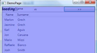
What is an Adorner? An Adorner can be used to draw on top of another element. For example imagine that you have an application that shows data in a ListView. When the user enters a search you want to show a loading status that disables the UI (something like the screen shot below)
In such a scenario an adorner comes very handy because you can basically draw a shade over the UI and maybe put in some text… for more info click here.
The Adorner class
In WPF to build an adorner is relatively simple ( well if I can do it anyone can 😀 ). The first thing you will need to do is to create a class that inherits from the Adorner class. The Adorner class constructor accepts a parameter of type UIElement which is the UIElement that will be adorned i.e the adorner will be rendered on top of this element. So your constructor for the Custom Adorner would look something like this
public LoadingAdorner(Implement adornerElement)
: base(adornerElement)
{ }
Now that we sub classed the Adorner class and we have our code compiling we can start drawing. To draw you have to override a method from the Adorner class called OnRender. This method takes a DrawingContext as parameter which you can use to draw whatever you like. Let create a small example, let’s draw a Rectangle 🙂
protected override void OnRender(
System.Windows.Media.DrawingContext drawingContext)
{
drawingContext.DrawRectangle(Brushes.Blue, new Pen(Brushes.Red, 1),
new Rect(new Point(0,0), DesiredSize));
base.OnRender(drawingContext);
}
So the code above will draw a blue Rectangle with a Red border.
Using the Custom Adorner
To use the custom adorner that we have created you will need to add it to an AdornerLayer. You can do this by calling the static method GetAdornerLayer of the AdornerLayer class. This method will walk up the VisualTree and potentially find an AdornerLayer which can be then used to render adorners. Once you have an instance of the AdornerLayer you can call the Add method and pass an instance of your custom adorner class. Once you add your Custom Adorner in the AdornerLayer, it will be rendered inside that AdornerLayer without disturbing your UIElement. The code to do this should look similar to this
AdornerLayer parentAdorner = AdornerLayer.GetAdornerLayer(mainPane);
parentAdorner.Add(new LoadingAdorner(mainPane));
Note: If the AdornerLayer.GetAdornerLayer is returning you null it means that you have no AdornerLayer in your VisualTree. You can add an AdornerLayer by using the AdornerDecorator in your XAML. Something like this.
<AdornerDecorator>
<DockPanel Name="mainPane">
</DockPanel>
</AdornerDecorator>
Some other useful tips
If you want to render a UIElement inside an adorner you will have to communicate this to the layout system so that it knows that it needs to layout the element. Usually you do not do such a thing in an adorner but still you can find this very useful. I used this when I was creating drag and drop for listboxes.
An adorner is also affected by Transforms. By this I mean, if you have a Layout/Render transform on the element being adorned, for example a ScaleTrasform, the adorner will be transformed as well. I encountered this while developing Jasema v2
The Demo Application
I created a small Demo application which is available for download here. The application basically has a relatively simple user interface. Basically I created a Listview that is binding to some data and a search box so that the user can filter that data by name. When the user clicks search, the user interface draws an Adorner signaling a loading status (I created a small hack so that I simulate some workload by using Thread.Sleep(2000). Do not do that in your real life application! ). In this demo I used the MVC design pattern by using WPF commands which is really interesting. For more info on MVC and WPF visit this post.
